Tutorial 2
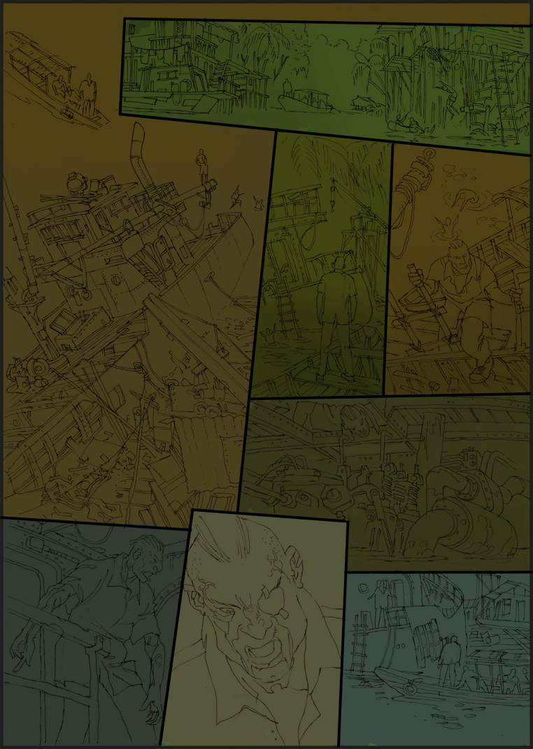
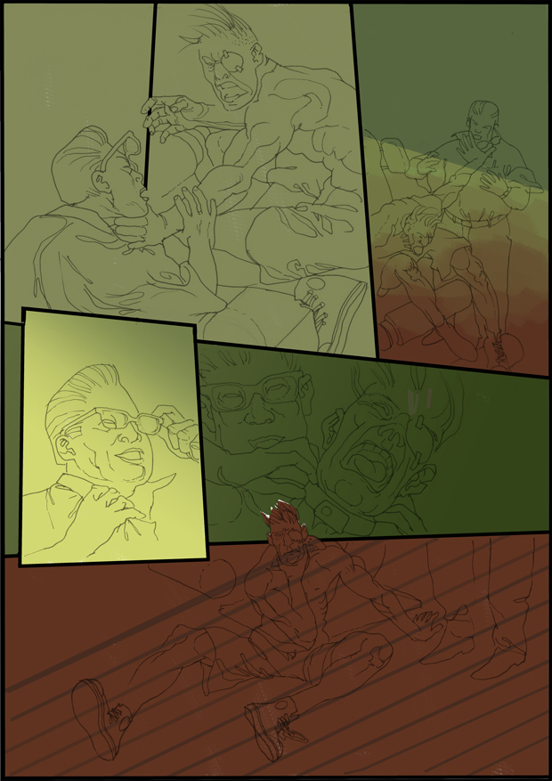
Nous avons déjà parlé. La couleur est la plus difficile pour la plupart des artistes. Depuis je travaille actuellement sur une nouvelle page, je tiens à vous dire une fois de plus ma manière de pré-base. Non pas parce qu’il est la seule correcte, mais il contient sa propre logique et ils peuvent être tellement comme une utilisation Navi et ne pas toujours avoir à penser ce que pourrait être la prochaine étape maintenant.
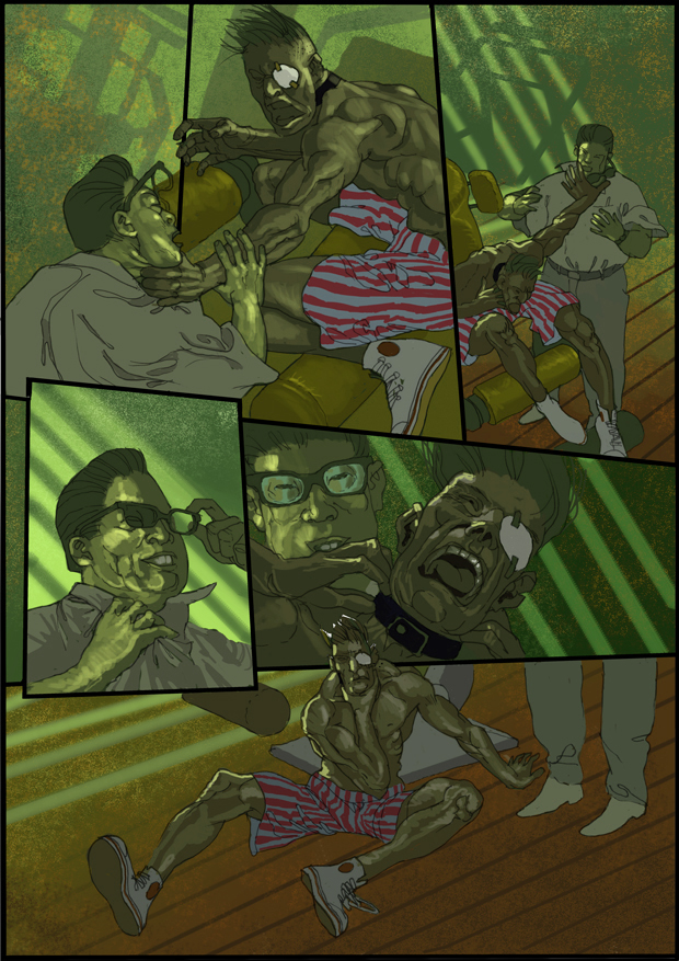
Comme avant, toujours vrai de gros travaux selon Klein. Tout d’abord, la couleur de base pour créer celui envisagé par l’ambiance générale de la page. Dans mon cas, vert. Jungle sombre couvert de ciel spährlichem et des taches de lumière à travers les feuilles. Il en résulte une grande tension. Beaucoup de noir, de faible luminosité. Vous savez ce du film. Mais ce scénario devrait être un préalable clair. Soit regarder dans votre tête ou faites défiler dans les livres d’autres illustrateurs. En outre, les classiques ne jamais oublier. Ils sont toujours invaincus en termes de leur métier.
J’ai donc été masqué toutes les photos individuelles et mettre ombre approximative dans tout. Juste pas plus blanc sur la page. Et pas de couleurs de feu. Nous en avons besoin pour la finition. Donc cassé couleurs avec un pourcentage élevé de gris.
We have already talked about it. Color is the most difficult for most artists. Since I am currently working on a new page, I want to tell you once again my Pre-Based manner. Not because it is the only correct one, but it contains its own logic and they can be so much like a Navi use and does not always have to think what could be the next step now.
As before, always true of large work according to Klein. First of all, the base color to create the one envisaged by the overall mood for the page. In my case, green. Dark jungle covered with spährlichem sky and light spots through the leaves. This results in a large voltage. Lots of dark, low light. You know this from the movie. But this scenario should be a clear beforehand. Either look in your head or scroll in books of other illustrators. Also, the classics never forget. They are still unbeaten in terms of their craft.
So I have been masked all the individual pictures and put an approximate shade under everything. Just no more white on the page. And no fiery colors. We need them for the finish. So broken colors with a high percentage of gray.
Wir haben schon einmal darüber gesprochen. Farbe ist das Schwierigste für die meisten Künstler. Da ich gerade an einer neuen Seite bin möchte ich euch noch einmal meine Vorgehendsweise erklären. Nicht weil sie die einzige richtige ist, aber sie beinhaltet eine eigene Logik und man kann sie so ähnlich wie ein Navi benutzen und muß nicht immer nachdenken was nun der nächste Schritt sein könnte.
Nach wie vor gilt immer von Groß nach Klein arbeiten. Erst einmal die Basisfarbe anlegen die einem als Gesamtstimmung für die Seite vorschwebt. In meinem Fall Grün. Dunkler Jungel mit spährlichem Himmel und Lichtflecken die durch die Blätter fallen. Das ergibt eine große Spannung. Viel Dunkel, wenig Licht. Ihr kennt das auch aus dem Film. Aber dieses Scenario sollte einem schon vorher klar sein. Entweder im eigenen Kopf nachsehen oder in Büchern von anderen Illustratoren blättern. Auch die Klassiker nicht vergessen. Sie sind nach wie vor ungeschlagen was ihr Handwerk angeht.
Ich habe also die ganzen einzelnen Bilder schon maskiert und lege einen ungefähren Farbton unter alles. Bloß kein Weiß mehr auf der Seite. Und keine feurigen Farben. Die brauchen wir für das Finish. Also gebrochene Farben mit hohem Grauanteil.
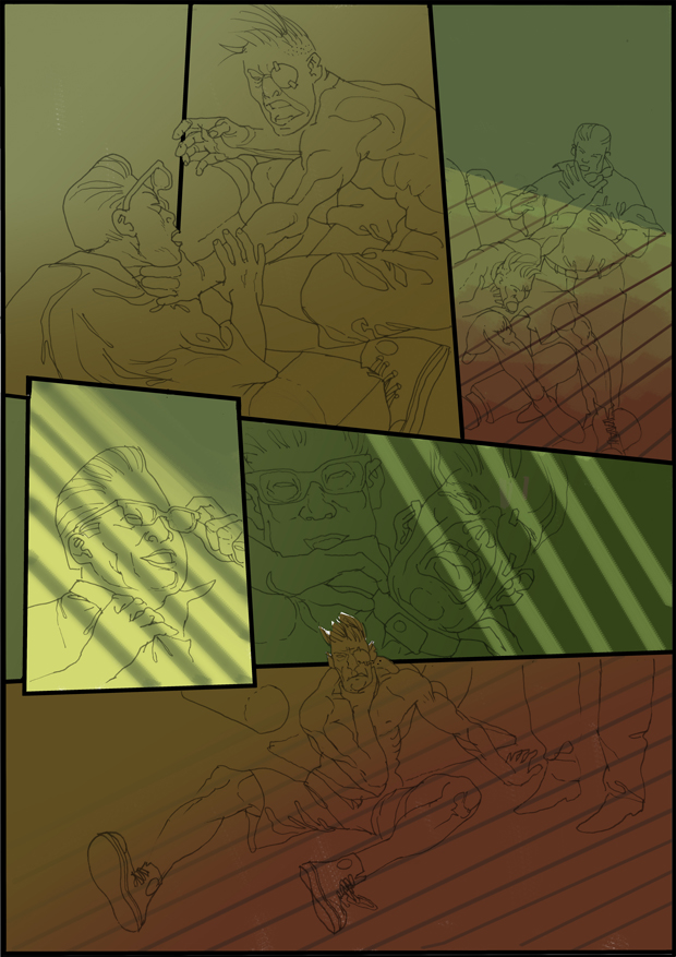
Ainsi, vous pouvez être en désaccord sur le vert. Mais d’abord je dois un vert selon mon plan et pas plus blanc dans l’image. Toutes les couleurs que je vais maintenant aussuche en outre être plus axés sur ce vert. Cela m’aide absence de valeurs aberrantes dans la couleur d’avoir. Maintenant, je me demande ce que les couleurs que je veux avoir les différentes scènes. Plus à l’extérieur ou à l’intérieur. Rétro-éclairage …. etc
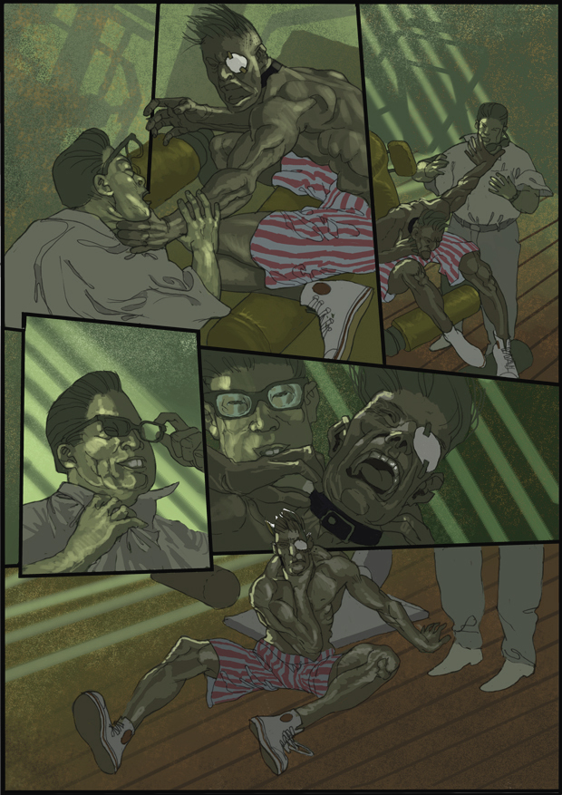
So, you may disagree on the Green. But first I have a green according to my plan and no more white in the image. All colors that I will now aussuche additionally be geared more to this green. This helps me no outliers in the color to have. Now I’m wondering what colors I want to have the individual scenes. More outdoors or indoors. Backlight …. etc
So, man kann geteilter Meinung über das Grün sein. Aber erst mal habe ich ein Grün entsprechend meinem Plan und kein Weiß mehr im Bild. Alle Farben die ich jetzt zusätzlich aussuche werden sich immer an diesem Grün orientieren. Das hilft mir kein Ausreißer in den Farben zu haben. Jetzt überlege ich mir in welchen Farben ich die einzelnen Szenen haben will. Mehr draußen, oder drinnen. Gegenlicht….etc
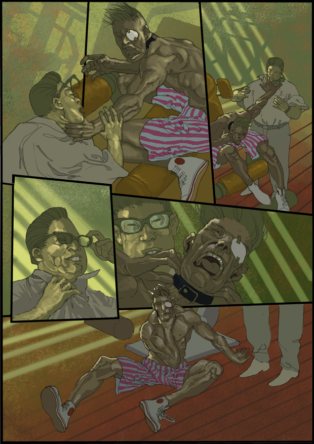
Donc, vous voyez, il prend forme. Jungle verte, l’eau brune, la salle des machines est sombre, la tête de Lambert avant Jungelgrün. En tout cas, je reçois une différenciation de couleur lent. Ne doit pas être ennuyeux. Tout se passe bien avec le vert. Mais l’eau brune je n’aime toujours pas à rougeâtre, quelque chose tombe et tout est encore quelque chose de mort qui n’a pas d’importance, n’est que le début. Et ainsi de suite vous aller …
So you see, it takes shape. Green jungle, brown water, the engine room is dark, the head of Lambert before Jungelgrün. In any case, I get a slow color differentiation. Should not be boring. Everything goes well with green. But the brown water I still do not like about to reddish, something falls out and everything is still something dead that does not matter, is just the beginning. And so on you go …
So ihr seht, es nimmt Gestalt an. Grüner Jungel, braunes Wasser, Maschinenraum dunkel, der Kopf von Lambert vor dem Jungelgrün. Auf jeden Fall bekomme ich langsam eine farbliche Differenzierung. Soll ja nicht langweilig werden. Alles harmoniert mit Grün. Aber das braune Wasser gefällt mir noch nicht, etwa zu rötlich, fällt etwas raus und alles ist noch etwas tot. Macht nix, ist ja erst der Anfang. Und so gehts weiter…
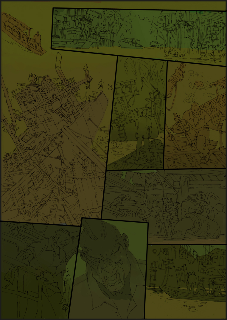
J’ai l’eau fait légèrement verdâtre par le vert je inveigled avec une opacité de 10% à 15% au-dessus de l’eau brun avec un gradient. Il devient plus vive et prépare déjà le travail plus tard sur l’eau. Ont également dans Panneau 4 et 7 où la tête Lambert est de race pure par le bas de l’obscurité pour obtenir un cours. Pratiquement seulement pris la keynote avec un peu plus noir et 15% d’opacité. Mais vous pouvez voir comment le parcours dans l’eau toute la page est harmonieux. Il vous suffit de droit plus et c’est la meilleure base pour la finition. En outre, les augmentations par les courbes, les valeurs tonales que j’ai fournis bébé plus tard, peuvent ablutschen avec le Pimpette et apporter des modifications minimales par les couleurs appropriées pour les objets restants. Et ce qui est important. Je reçois lentement une plasticité sans déjà utilisé dans le pot tentant de belles couleurs à avoir. En outre, chaque couleur est aussi grande que sa couleur voisine permet. A fait, bien que très lointain, quelque chose à faire avec la mise en Realitivitätstheorie de Eini. Et mon plan, comment pouvez-vous vous rappeler que vous est très noir, sombre et mystérieux vert et peu dispersés liche. Alors maintenant, j’ai traité dans tous les grands domaines, jungle, l’eau, et de l’intérieur. Ce qui reste est le ciel. Et comme nous allons le voir de lui seulement un peu, je vais prendre à droite une couleur de ciel qui pourrait subsister. Et affiche simultanément l’autre extrémité de la luminosité et de l’ampleur de contraste. Subventions il commence à être délicieux.
I have the water made slightly greenish by green I inveigled with opacity 10% -15% above the brown water with a gradient. It becomes more vivid and already preparing the later work on the water. Also have in Pannel 4 and 7 where Lambert head is pure-bred from below some dark to get a course. Practically only taken the keynote with a little more black and 15% opacity. But you can see how through the green in the water the whole page is harmonious. You simply right more and this is the best base for the finish. In addition, increases by the curves, the tonal values that I provided babe later, can ablutschen with the Pimpette and make minimal changes by the appropriate colors for the remaining objects. And what is important. I slowly get a plasticity without previously used in the tempting pot of great colors to have. Besides, each color is only as great as its neighboring color allows. Has actually, though very distant, something to do with the setting Eini’s Realitivitätstheorie. And my plan, how can you remember you is lots of dark, gloomy and mysterious green and little scattered Lich. So now I have treated in all the major areas, jungle, water, and interior. What remains is the sky. And as we will see from him only a little I’ll be right take a sky color that might remain. And it shows at the same time the other end of the brightness and the contrast scale. Grants it begins to be delicious.
Ich habe das Wasser etwas grünlicher gemacht indem ich grün mit Deckkraft 10% -15% über das braunen Wasser mit einem Verlauf reingezogen. Es wirkt lebendiger und bereitet schon die späteren Arbeiten am Wasser vor. Habe auch im Pannel 4 und 7 wo Lambert Kopf ist von unten etwas Dunkelheit reingezogen um einen Verlauf zu bekommen. Praktisch nur den Basiston mit etwas mehr Schwarz genommen und 15 % Deckkraft. Aber ihr seht wie durch das Grün im Wasser die ganze Seite harmonischer wird. Sie stimmt einfach mehr und das ist die beste Basis für das Finish. Außerdem vergrößert sich durch die Verläufe auch die Tonwerte die ich später zur Verfügung babe, mit der Pimpette ablutschen kann und durch minimale Veränderungen zu den passenden Farben für die restlichen Objekte mache. Und was wichtig ist. Ich bekomme langsam eine Plastizität ohne bisher in den verlockenden Topf der tollen Farben gegriffen zu haben. Nebenbei ist jede Farbe nur so toll wie es ihre Nachbarfarbe es zuläßt. Hat tatsächlich auch, zwar sehr entfernt, etwas mit der Einsteinischen Realitivitätstheorie zu tun. Und mein Plan, wie ihr euch entsinnen könnt ist, viel dunkles, düsteres und geheimnisvolles Grün und wenig verstreutes Lich. Also ich habe jetzt an sich alle großen Flächen behandelt, Jungel, Wasser und Innenraum. Was bleibt ist der Himmel. Und da wir von ihm nur wenig sehen werden werde ich gleich eine Himmelsfarbe nehmen die vielleicht auch bleiben könnte. Und sie zeigt zugleich das andere Ende der Helligkeits und Kontrast Skala. Jezt beginnt es schon lecker zu werden. 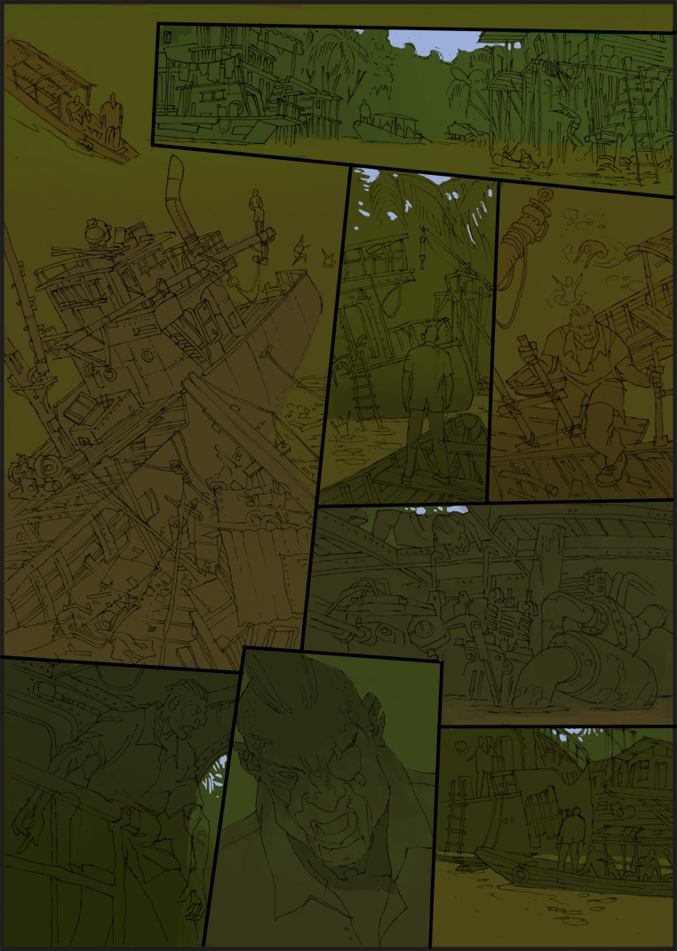
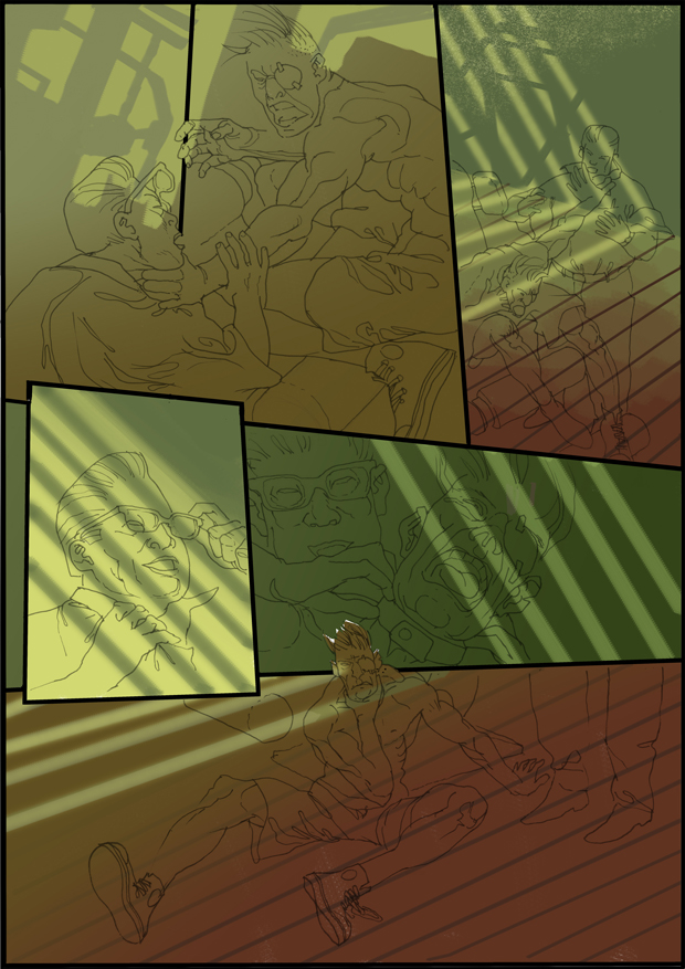
Maintenant, je me rends compte que je suis sur la bonne page. L’ambiance répond lentement mes attentes. Les paramètres de base sont fixés à l’endroit où je peux trouver mon chemin dans la couleur. Je vais vous montrer comment ça se passe.
La finition
.. Et entre aussi nerveux, je suis pas à l’abri de tout et parfois je reçois un dérapage. Mais maintenant, le site est seulement une fois terminé. Bien sûr, je vais vous montrer quelque chose raccourcit le voyage. Juste une remarque en passant. J’avais l’habitude de travailler avec 3oo dpi. Aujourd’hui, avec 600 parce que vous pouvez mieux gérer les complexités. Le danger est juste à temps pour ralentir en raison de la réduction des subtilités sont souvent contracté en bouillie méconnaissable. C’est seulement dans des cas particuliers travaillent beaucoup et de ne pas être tentés. C’est vraiment une question de timing. Mais ce sera le signataire de vous le savez déjà.Now, I realize that I’m on the right page. The mood slowly meets my expectations. The basic parameters are set to where I can find my way in color. I’ll show you how it goes.
The finish
.. And in between also nervous, I’m also not immune to everything and sometimes I get into a skid. But now the site is only once finished. Of course I’ll show you something shortens the journey. Just a note in passing. I used to work with 3oo dpi. Today, with 600 because you can better handle the intricacies. The danger is just in time to slow down because of the reduction in subtleties are often contracted into unrecognizable mush. That is only in special cases work great and not to be tempted. It really is a timing issue. But that will be the signatory of you know already
Jetzt merke ich das ich auf der richtigen Seite bin. Die Stimmung entspricht langsam meinen Vorstellungen. Die Eckwerte sind gesetzt an denen ich mich farblich orientieren kann. Ich zeige euch wie es weitergeht.
Das Finish
..und zwischendurch auch Nerven, bin auch nicht gegen alles gefeit und manchmal komme ich ins Schleudern. Aber jetzt ist die Seite erst mal fertig. Ich zeige euch natürlich die Reise etwas verkürzt. Noch eine Anmerkung am Rande. Ich habe früher mit 3oo dpi gearbeitet. Heute mit 600 weil man die Feinheiten besser bearbeiten kann. Die Gefahr ist nur sich rechtzeitig zu bremsen da in der Verkleinerung Feinheiten oft zu nicht mehr erkennbaren Mus zusammengezogen werden. Das heißt nur in einzelnen Fällen groß arbeiten und sich nicht verlocken zu lassen. Ist ja auch ein Zeitproblem. Aber das werden die Zeichner unter euch schon wissen.
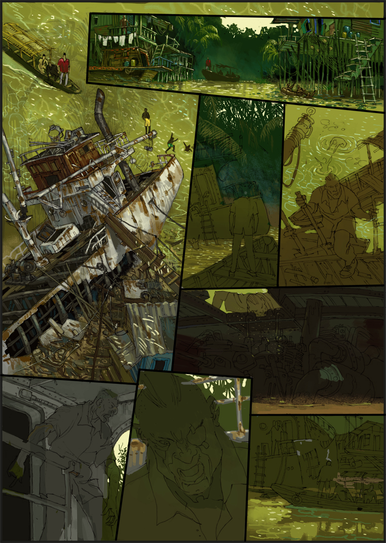
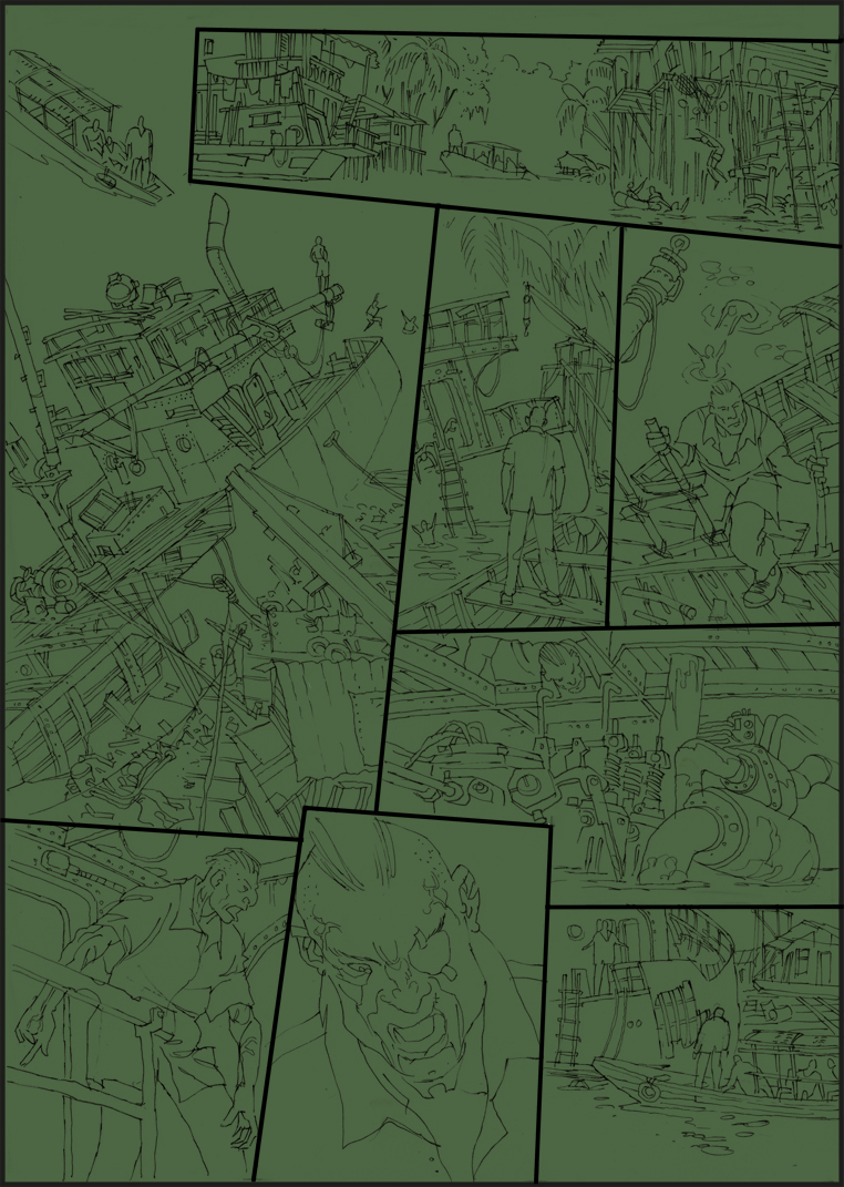
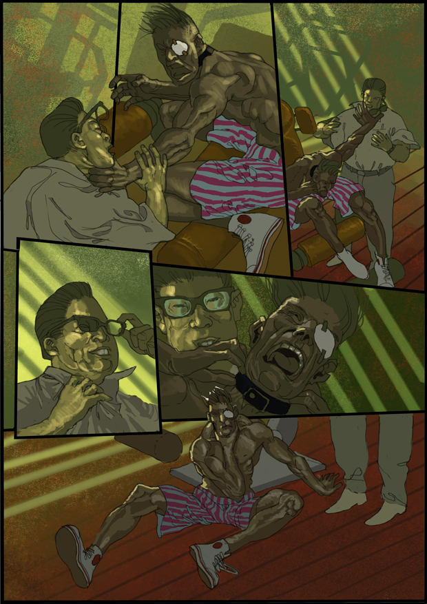
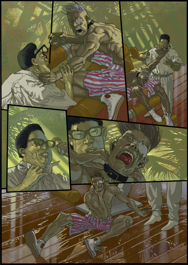
Ainsi de suite avec le texte. Je n’ai pas mémorisé toutes les étapes intermédiaires dans l’ordre chronologique. Mais je l’ai fait aujourd’hui, les panneaux individuels toujours prêt sur leur propre. Quand vous faites les panneaux est plus apparent par rapport individuel. Pour la moitié de la simplicité mais je ne maintenant publié page par page. Donc, mes notes sont désormais toujours par rapport à la page entière et non individuellement. À 3 et 4 de l’eau et de la jungle ajoutés, la salle des machines a foncé à 5, 6 à l’arrière-plan et de la jungle, la jungle du navire au 6 et avant qu’une partie de la balustrade égal peint avec de la rouille et 7 de l’eau avec l’ombre du bateau.
So on with the text. I have not stored all intermediate steps in chronological order. But I have made now, the individual panels always ready on their own. When you make the panels is more apparent compared individually. For simplicity’s half but I did now published page by page. So my notes are now always relative to the whole page and not individually. At 3 and 4 water and jungle added, the engine room made dark at 5, 6 at the ship’s background and jungle, jungle at 6 and before that a part of the railing equal painted with rust and 7 water with shadow of the boat.
Also weiter im Text. Ich habe nicht alle Zwischenschritte chronologisch abgespeichert . Aber ich habe ab jetzt die einzelnen Panels für sich alleine immer fertig gemacht. Wenn ihr die Panels einzeln vergleicht wird das mehr ersichtlich. Der Einfachheit halbe habe ich das aber jetzt Seitenweise veröffentlicht. Also sind meine Erläuterungen jetzt immer auf die ganze Seite bezogen und nicht einzeln. Bei 3 und 4 Wasser und Jungel zugefügt, bei 5 den Machinenraum dunkel gemacht, bei 6 den Schiffshintergrund und Jungel, bei 6 Jungel und davor ein Teil des Geländers gleich mit Rost gemalt und in 7 Wasser mit Schatten des Bootes.
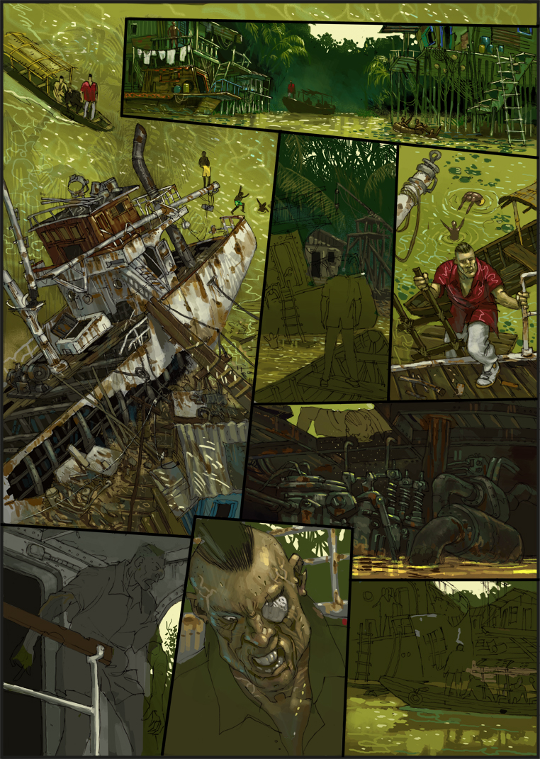
Maintenant avec 3 bâtiments en arrière-plan et avant que certains des feuilles de palmier, à 4 couleurs de base ainsi ajouté une certaine modification de la lumière / obscurité. Je voulais Lambers chemise rouge, une fois lu conjointement avec les autres couleurs, donc une fois peint finition. 5, la machine purement peint, à 6 la balustrade au premier plan, à 7 Lamberts tête complètement visible autour de la couleur de la peau et inséré dans le ciel jaune 8.
Now with 3 buildings in the background and before some palm leaves, at 4 basic colors plus added a certain modification of light / dark. I wanted Lambers red shirt once read in conjunction with the other colors, so once painted finish. 5, the machine purely painted, at 6 the railing in the foreground, at 7 Lamberts completely visible head around the skin color and inserted into the 8 yellow sky.
Jetzt bei 3 die Gebäude im Hintergrund und davor einige Palmenblätter, bei 4 alle Grundfarben eingefügt plus einer gewissen Modifizierung Hell /Dunkel. Ich wollte Lambers rotes Hemd einmal im Zusammenhang mit den anderen Farben sehen, daher einmal fertig gemalt. In 5 die Maschine rein gemalt, bei 6 das Geländer im Vordergrund, bei 7 Lamberts Kopf komplett um die Hautfarben zu sehen und in 8 den gelben Himmel eingefügt.
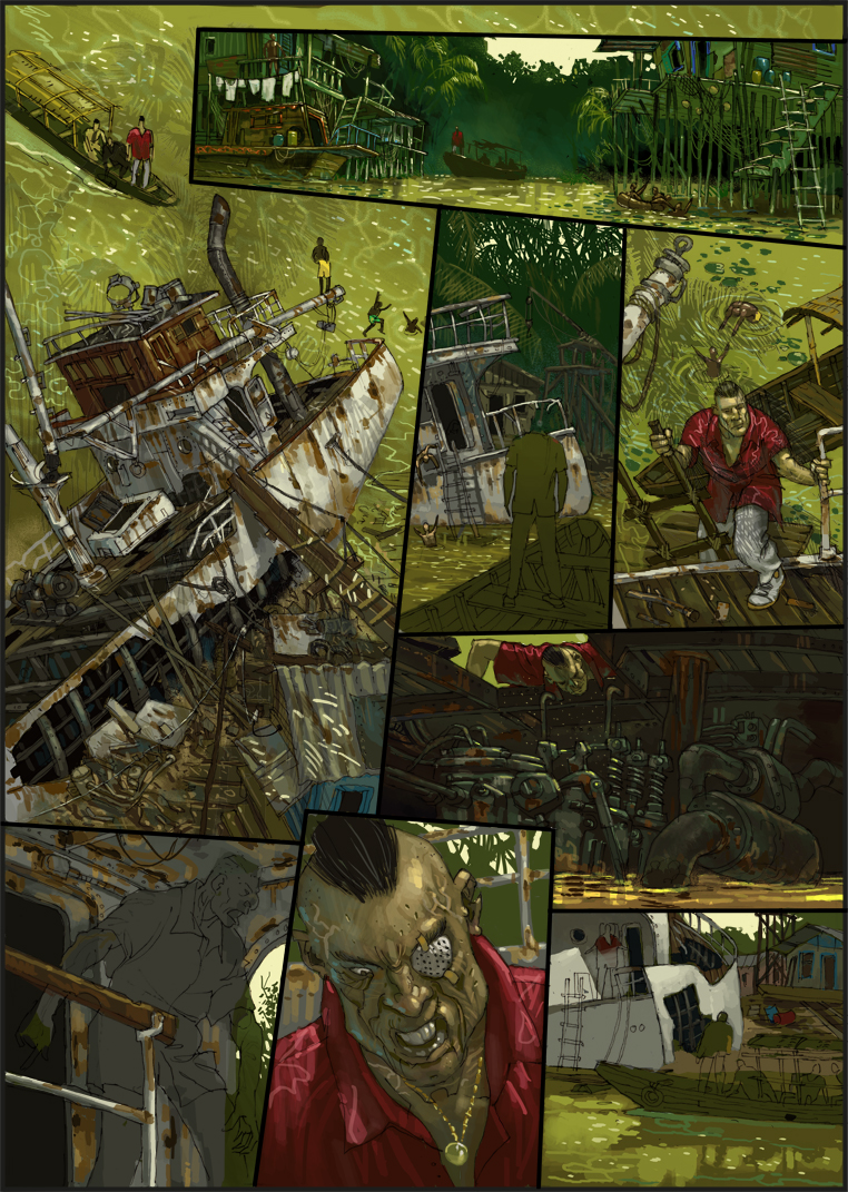
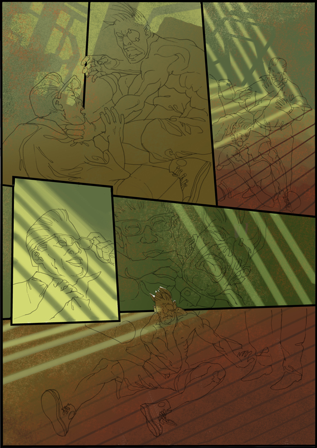
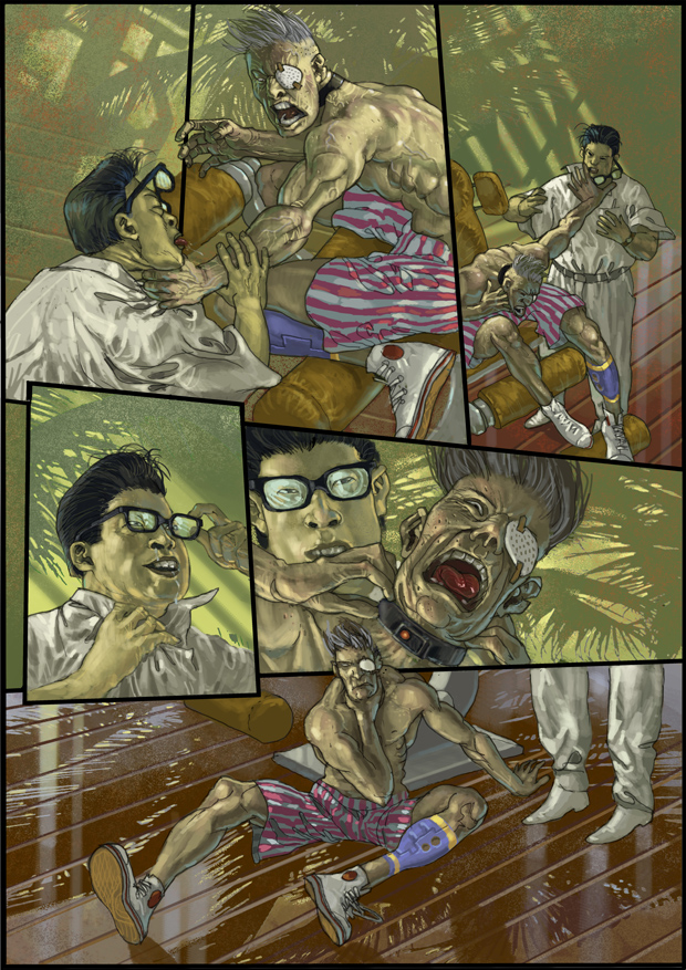
Maintenant, insérez le navire en 3 et 4 à l’ombre des feuilles de palmiers sur l’eau. Dans 5 la salle des machines que j’ai Lambert peint dans la trappe, la rouille peint en 6 sur le bateau, en chemise et 7Lamberts monocle et 8 dans les bâtiments de fond et le navire au premier plan.
Maintenant, insérez le navire en 3 et 4 à l’ombre des feuilles de palmiers sur l’eau. Dans 5 la salle des machines que j’ai Lambert peint dans la trappe, la rouille peint en 6 sur le bateau, en chemise et 7Lamberts monocle et 8 dans les bâtiments de fond et le navire au premier plan.
Jetzt in 3 das Schiff eingefügt und in 4 die Schatten der Palmwedel auf dem Wasser. In 5 den Maschinenraum habe ich Lambert in die Luke gemalt, in 6 den Rost auf das Schiff gemalt, in 7Lamberts Hemd und Monokel und in 8 die Hintergrundgebäude und das Schiff im Vordergrund.
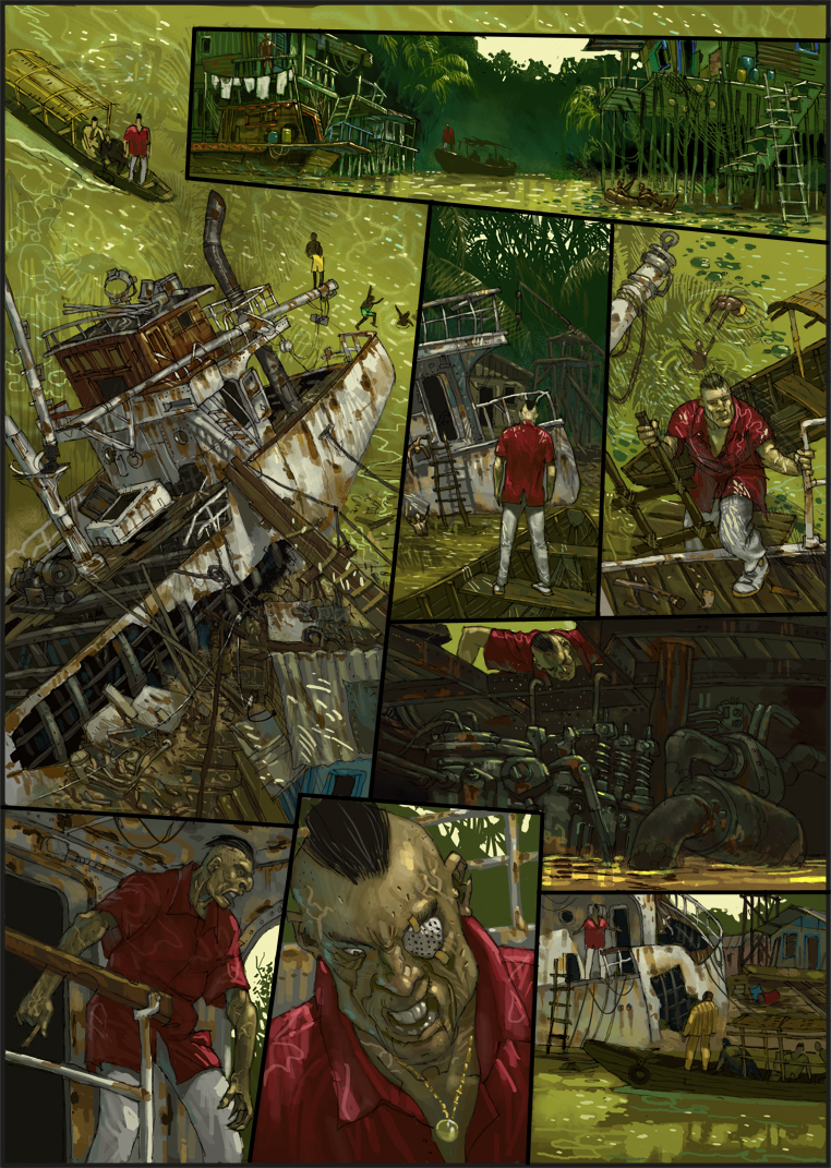
Lambert peint purement 3, 4 chaises réflexions sur Lamberts pantalon de peau et chemise, Lambert 6 et 8 de la rouille sur le navire, Lambert et le bateau avec les passagers à l’avant-plan. C’est tout.
Lambert painted purely in 3, 4 sun reflections on Lamberts skin pants and shirt, Lambert 6 and 8 rust on the ship, Lambert and the boat with passengers in the foreground. That’s it.
Lambert in 3 rein gemalt, in 4 Sonnenreflexe auf Lamberts Haut Hose und Hemd, in 6 Lambert und in 8 Rost auf das Schiff, Lambert und das Boot mit Insassen in den Vordergrund. Das wars.
Tutotial 1
Bien sûr, je sais que vous avez de la signataire leurs propres procédures. Je me tiens là aucune critique erlauben.Ich suis sûr que certains d’entre vous d’accord que des trucs sur ce que je ne sais même pas. Alors regardez à apporter la contribution comme une autre façon quelque chose de si sur le papier, comme vous l’imaginez. Et je ne peux dire que c’est une de mes façons de façon sécuritaire que possible pour parvenir à un résultat optimal. D’autres voies sont possibles, comme je l’ai expliqué précisément. Bien sûr, ce chemin se réfère principalement à des pages dessinées et pas nécessairement sur l’illustration. La différence? Une illustration est le seul sans concurrence. Chaque illustration peut avoir une façon différente de la musique. Cela peut même être souhaitable. Mais si vous avez une bande dessinée son aufschlagt il a toujours à voir avec une double page. Et disons avec 10 illustrations différentes. Depuis variations de chute de qualité immédiatement. Man compare. Non seulement cela, la conception générale doit être droite. Une fausse image fesse le cadre formel de la page. Et, il doit régner une ambiance de correspondance des couleurs malgré couleur différente. Comme je le disais, une pomme pourrie gâte le panier entier. Bien sûr il ya des illustrateurs qui utilisent systématiquement pour l’ensemble de l’album une palette de couleurs fixe. Ceci réduit le risque un peu. Mais si je me abarbeite de limites, et l’échange Paruline a lieu sur un côté, je dois regarder. Mettre le tout ensemble, même avec une certaine pression économique, me force à avoir un concept reproductible avec qui je peux travailler sans corrections majeures. Pour ainsi dire, une piste sur laquelle je propose. Pourquoi suis-je même encore parler sortir – je sais qu’il ya encore des débutants enthousiastes ont de grands projets et de grandes histoires. J’ai certains savent en tant que conférencier dans mon temps et certains vont certainement poursuivre mon bloc. Pourtant, s’il est évident ce que je dis, mais ils ont souvent des difficultés à suivre l‘. Ce qui a eu malheureusement a aussi à voir en partie, l’école, même si je me demandai à plusieurs reprises de ne pas l’utilisation de l’ordinateur vacants espaces inclinables permis, qui ont été équipés d’un vidéo projecteur et un grand nombre d’emplois pour la classe exactement ces choses coûtent pour tous traiter. Il ne veut tout simplement pas faire, en tant que conférencier dans une classe bondée à côté d’un étudiant avec un écran d’ordinateur portable de popeiligen à genoux où à peine 6 étudiants des angles idiots peuvent être vus. Mais ce n’est pas la question. Je veux que ceux qui sont encore incertains ont une manière qui fonctionne bien si vous vous y tenez. J’étais déjà quelque chose dans un post précédent, mais ils étaient trop rapides étapes et c’était plus sur le dessin et le résultat final. Un résultat final, il n’y a pas encore disponibles pour cette page, mais dans quelques jours. Je ne vais pas refuser de vous.
Tutotial 1
Of course I know of you have the signatory their own procedures. I want me there no criticism erlauben.Ich am quite sure that some of you agree have stuff on it that I do not even know. So look to make the contribution as another way something so down on paper, as you would imagine. And I can only say this is one of my ways to safely as possible to come to an optimal result. Other ways are possible, as I explained precisely. Of course, this path refers primarily to comic pages and not necessarily on illustration. The difference? An illustration stands alone without competition. Each illustration may have a different way of music. This may even be desirable. But if you have a comic book aufschlagt her it always has to do with a double page. And let’s say with 10 individual illustrations. Since fall variations in quality immediately. Man compares. Not only that, the overall design must be right. A false image spanks the formal context of the page. And, it must reign a color-matching mood despite different color. As I said, one bad apple spoils the whole basket. Of course there are illustrators who use consistently for the whole album a fixed color palette. This minimizes the risk a bit. But if I abarbeite me to limits, and the Warblers exchange takes place on one side I have to watch. Putting it all together, even with a certain economic pressure, forces me to have a repeatable concept with which I can work without any major corrections. So to speak, a track on which I move. Why am I still even talk come out – I know that there are still enthusiastic beginners have big plans and big stories. I have some know as a lecturer in my time and some will certainly pursue my block. Yet, though it is obvious what I say, yet they have often difficulties to follow the. This had unfortunately also has to do in part, the school, even though I repeatedly begged me not to the use of vacant computer Tipped spaces allowed, which were equipped with a video projector and a lot of jobs to the classroom exactly these things cost for all treat. It just will not do, as a lecturer in a crowded class next to a student with popeiligen laptop screen to kneel where barely 6 students from idiotic angles can be seen. But that’s not the issue. I want those who are still unsure have a way that works well if you stick to it. I was already something in a previous post but they were too quick steps and it was more about the drawing and the final result. A final result, there are not yet available for this page, but in a few days. I will not withhold it from you.
Tutotial 1
Natürlich weiß ich das die Zeichner unter euch ihre eigene Vorgehensweisen haben. Ich möchte mir da auch keine Kritik erlauben.Ich bin mir sogar sicher, das einig von euch einige Sachen draufhaben von denen ich nicht einmal weiß. Also seht den Beitrag als eine weitere Möglichkeit etwas so zu Papier zu bringen, wie man es sich vorstellt. Und ich kann nur sagen, das ist einer meiner Wege um möglichst sicher zu einem optimalen Ergebnis zu kommen. Es sind auch andere Wege möglich, wie ich eben erläuterte. Natürlich bezieht sich dieser Weg vorrangig auf Comic Seiten und nicht unbedingt auf Illustration. Der Unterschied? Eine Illustration steht für sich, ohne Konkurrenz. Jede Illustration kann eine andere Stielrichtung haben. Das kann sogar erwünscht sein. Aber wenn ihr ein Comic Book aufschlagt habt ihr es immer mit einer Doppelseite zu tun. Und sagen wir mal mit 10 einzelne Illustrationen. Da fallen Qualität Schwankungen sofort auf. Mann vergleicht. Nicht nur das. Die Gesamtgestaltung muss stimmen. Ein falsches Bild verhaut den formalen Zusammenhang der Seite. Und, es muss trotz unterschiedlicher Farbigkeit eine farblich zusammenpassende Grundstimmung herrschen. Wie gesagt, ein fauler Apfel verdirbt den ganzen Korb. Natürlich gibt es Illustratoren die benutzen durchgängig für das ganze Album eine festgelegte Farbpalette. Das minimiert das Risiko ein bisschen. Wenn ich mich aber an Grenzwerten abarbeite, und der WarbWechsel auf einer Seite stattfindet muss ich aufpassen. Das alles zusammen, auch noch mit einem gewissen ökonomischen Druck, zwingt mich dazu ein wiederholbares Konzept zu haben, mit dem ich ohne große Korrekturen arbeiten kann. Sozusagen ein Gleis auf dem ich mich bewege. Warum ich darauf jetzt noch einmal zu sprechen komme – ich weiß das es immer noch begeisterte Anfänger gibt die große Pläne und große Geschichten haben. Ich habe einige in meiner Zeit als Dozent kennengelernt und einige werden bestimmt meinen Block verfolgen. Und doch, obwohl es einleuchtend ist was ich sage, so haben sie doch oft Schwierigkeiten dem zu folgen. Das hatte leider zum Teil auch damit zu tun, das mir die Schule, obwohl ich mehrmals darum bat, nicht die Nutzung von leerstehenden Computerbestückten Räumen gestattete, die mit Beamer und jeder Menge Arbeitsplätzen ausgerüstet waren, um im Unterricht genau diese Dinge für alle einsehbar zu behandeln. Es geht einfach nicht, als Dozent in einer überfüllten Klasse neben einem Schüler mit popeiligen Laptop Bildschirm zu knien dem gerade mal 6 Schüler aus idiotischen Blickwinkeln sehen können. Aber das ist nicht das Thema. Ich möchte denen die noch unsicher sind einen Weg weisen, der gut funktioniert, wenn man sich daran hält. Ich zeigte schon einmal etwas in einem vorherigen Beitrag aber das waren zu schnelle Schritte und es ging mehr um die Zeichnung und das Endergebnis. Ein Endergebnis gibt es für vorliegende Seite noch nicht, aber in einigen Tagen. Ich werde es euch nicht vorenthalten.
Dans le panneau, les couleurs sont utilisées. Bien qu’ils soient différents, ils ont une racine commune. Puis chercher. A partir de maintenant, vous cherchez pas de couleur sur un fond blanc, mais toujours du corps à la couleur de l’image respective. Mais avant d’entrer dans les détails, je dois l’ordre dans la grande. Pour cela j’ai besoin de savoir ce qui se passe en arrière-plan. Donc, il ne semble pas ennuyeux, j’ai un plan et voir peu de fond, je construis une fois certains cours d’un
In the panel, the basic colors are used. Although they are different they have a common root. Then look for. From now on, you seek no color against a white background, but always fitting to the respective image color. But before I go into the details, I need order in the large. For this I need to know what is happening in the background. So it does not look boring, I have a plan and see little background, I build once some courses a
In dem Panel werden die Basisfarben eingesetzt. Auch wenn sie unterschiedlich sind haben sie einen gemeinsamen Grundton. Darauf ist zu achten. Ab jetzt sucht ihr keine Farbe mehr vor einem weißen Hintergrund, sondern immer passend zu der jeweiligen Bildfarbe. Aber bevor ich in das Detail gehe, brauche ich Ordnung im Großen. Dafür muss ich wissen was im Hintergrund geschieht. Damit es nicht langweilig aussieht, ich habe eine Aufsicht und sehe wenig Hintergrund, baue ich erst einmal einige Verläufe ein
On dirait même mieux. Je ne peux penser à de la lumière qui jette ses rayons à travers les lattes, qui pourriez-vous lui voir sur la page 1. La lumière permet drame. Je l’aime. Vous pouvez laisser rip avec elle des images que bons. J’envisage ce machines de sport pour l’ombre pourraient jeter sur les murs.
Looks even better. I can think of the light that casts its rays through the slats, which could you see her on page 1. Light makes drama. I love it. You can let rip with it only right images. I’m considering what sports machines for shade could throw at the walls.
Sieht schon besser aus. Mir fällt das Licht ein, das seine Strahlen durch die Lamellen wirft, die ihr auf der Seite 1 sehen konntet. Licht macht Dramatik. Ich liebe es. Ihr könnt Bilder damit erst richtig krachen lassen. Ich überlege mir, was Sportmaschinen für Schatten an die Wände werfen könnten.
Cela semble déjà mieux. Malheureusement, l’ordinateur présente l’inconvénient que cela fonctionne, en principe, très propre. Mais je veux que le vieux sentiment de l’école de la structure si indifférent mais aucune plâtre écaillé et dererleih choses. C’est un hôpital de haute technologie. Tout était propre. Alors, j’ai mis une structure sur ce qui pourrait aussi être de la poussière et de la lumière vacillante. Il augmente la sensibilité de l’image
This already looks better. Unfortunately, the computer has the disadvantage that it works in principle, very clean. But I want the old school feeling so indifferent structure but no chipped plaster and dererleih things. This is a high-tech hospital. Everything was clean. So I put a structure about which could also be dust and sunlight flickering. It increases the sensitivity of the image
Das sieht schon besser aus. Leider hat der Computer den Nachteil das er prinzipiell sehr sauber arbeitet. Ich will aber das Old School feeling, also indifferente Struktur aber kein abgesplitterten Putz und dererleih Sachen. Das ist eine High Tech Klinik. Alles sauber. Also lege ich eine Struktur darüber die auch Staub und Sonnenlicht Geflimmer sein könnte. Er erhöht die Sensibilität des Bildes
Alors maintenant, il est temps pour les gens. Vous portez un morceau par morceau les couleurs de l’objet et fait en sorte qu’ils s’adaptent. Que vous gérez dans the’re de travail contre une couleur central et pas toujours contre le blanc. Par ailleurs, que les anciens, tels que Rubens et toute la clique, faites de la même façon. Malheureusement, je n’ai pas cité cette étape, mais seulement après que j’ai été de penser à ajouter une seconde peau. Mais en principe, c’est la même. Mais est important que vous faites attention à ce qui suit. Même les tons clairs peuvent ne pas être les plus brillants, que vous placez sur l’image finale. Nous économisons que pour la fin. Les dernières lumières, ou des points saillants sont comme une épice. Trop de butin de la nourriture. Ceci conclut.
So now it’s time for people. You carry a piece by piece the object colors and makes sure that they fit. That you manage in the’re working against a central color and not always against white. By the way, that the ancients, such as Rubens and the whole clique, made the same way. Unfortunately, I have not quoted this step, but only after I’ve been thinking about added a second skin tone. But in principle this is the same. But is important that you pay attention to the following. Even the Bright tones may not be the brightest, as you hover on the final image. We save that for last. The last lights, or highlights are as a spice. Too much spoils the food. This concludes.
So jetzt ist es Zeit für die Menschen. Ihr tragt Stück für Stück die Objektfarben ein und achtet darauf, das sie passen. Das schafft ihr dadurch, das ihr gegen eine Zentralfarbe arbeitet und nicht immer gegen Weiß. Nebenbei, das haben die Alten, wie Rubens und der ganze Klüngel, genauso gemacht. Leider habe ich diesen Schritt nicht notiert, sondern erst nachdem ich einen zweiten Hautton darübergelegt habe. Aber im Prinzip ist das das gleiche. Aber wichtig ist, das ihr auf folgendes achtet. Selbst die Hellen Töne dürfen noch nicht die Hellsten sein, wie sie euch für das fertige Bild vorschweben. Das heben wir uns für den Schluss auf. Die letzten Lichter, oder Spitzlichter sind wie ein Gewürz. Zu viel verdirbt das Essen. Das kommt zum Schluss.
Maintenant, il est souvent le cas que si vous avez à ce point et vous faites une pause, l’image est très différente après une heure. D’une certaine manière ce qui est faux. Le premier engouement est terminée. Il ya aussi un nombre incroyable de facteurs que nous voulons obtenir sous un même toit. Un coup de génie, et même le meilleur parmi les lacunes de fonctionnement. Puis-je accéder aux «niveaux». Alors je prépare l’image sur la finition. Quelque chose de riche en contraste, peut-être un peu plus sombre de sorte que les points forts sont bien après. Il devrait ressembler à ceci.
Now it is often the case that if you’re got to this point and you make a pause, the picture looks very different after an hour. Somehow what is wrong. The first infatuation is over. There also are an incredible number of factors that we want to get under one roof. A stroke of genius, and even the best among running shortcomings. Then I access the „Levels.“ So I prepare the image on the finish. Something rich in contrast, maybe a little darker so that the highlights are good afterwards. It will look like this.
Nun ist es oft so, das wenn ihr zu diesem Punkt gekommen seid und ihr eine Pause macht, das Bild nach einer Stunde ganz anders aussieht. Irgendwie stimmt was nicht. Das erste Verliebtsein ist vorbei. Es sind ja auch unglaublich viele Faktoren die wir unter einen Hut bekommen wollen. Ein Husarenstück und selbst den Besten unterlaufen Unzulänglichkeiten. Dann greife ich zu der „Tonwertkorrektur“.Damit bereite ich das Bild auf das Finish vor. Etwas Kontrastreicher, vielleicht etwas Dunkler damit die Spitzlichter nachher gut stehen. Das sieht dann so aus.
Vous voyez l’image est devenue plus nette. Ainsi, vous pouvez l’avoir maintenant. Bien sûr, manque encore beaucoup de détails. Pantalons, chaussures, etc Ceci conclut. Mais si vous vous allez à l’avoine „Teinte / Saturation“. Et une fois que vous prenez le contraste. Maintenant, vous avez une image presque comme une vieille photo B / W.
You see the image has become sharper. So you can have it now. Of course, still missing a lot of details. Pants, shoes etc. This concludes. But if you oats you go to „Hue / Saturation“. And once you take out the contrast. Now you have a picture almost like an old B / W photo.
Ihr seht das Bild ist Schärfer geworden. So kann man es jetzt lassen. Natürlich fehlen noch jede Menge Details. Hosen, Schuhe etc. Das kommt zum Schluss. Aber wenn euch der Hafer sticht geht ihr in “ Farbton/Sättigung“. Und ihr nehmt einmal den Kontrast raus. Jetzt habt ihr fast ein Bild wie ein altes S/W Foto.

Avec le même outil et l’image de base son pousse maintenant rouge une fois pur. Une ambiance très différente.
With the same tool and the base image pushes her now once pure red. A very different mood.
Mit dem selben Tool und dem Basis Bild schiebt ihr jetzt einmal Rot rein. Eine ganz andere Stimmung.
Sombre, documentaire. Qui veut avoir plus la fraîcheur de la jungle pousse vert pur ….
Gloomy, documentary. Who wants to have more the coolness of the jungle pushes green pure ….
Düsterer, dokumentarischer. Wer mehr die Kühle des Jungels haben will schiebt Grün rein…..
Et si c’est trop dur …..
And if that’s too hard …..
Und wem das zu heftig ist…..
augmente le contraste à nouveau. Qui a le choix d’avoir, le plus dur, mais vous voyez ce que les options Photoshop offre. Seulement sans créativité et la pratique ne suffit pas. Mais vous pouvez aussi imaginer ce que les dernières lumières donnent l’image pour un effet final. Je vais vous montrer dans quelques jours. J’ai pris qui n’ont pas été manipulée image corrections de continuer à travailler. Les corrections que j’ai indiquées ne jamais faire de vous-mêmes maintenant que le bouche-arrosage. Je vais le faire à la fin. Et vous pouvez être sûr, plus l’image de vos besoins sont satisfaits, moins il pousse avec les curseurs de couleur autour.
increases the contrast out again. Who has the choice to have, the harder But you see what options Photoshop provides. Only without own creativity and practicing is not enough. But you can also imagine what the last lights give the image for a final effect. I’ll show you in a few days. I have taken that were not manipulated with corrections image to continue working. The corrections I have only ever been shown to make you yourselves now as mouth-watering. I’ll do that at the end. And you can be sure, the more the image of your needs are met, the less it pushes with the color sliders around.
nimmt den Kontrast wieder raus. Wer die Wahl hat, hat die Qual. Aber ihr seht welche Möglichkeiten Photoshop bietet. Nur, ohne eigene Kreativität und Üben reicht das nicht. Aber ihr könnt auch vorstellen was die letzten Lichter dem Bild für eine endgültige Wirkung geben. Ich werde es euch in einigen Tagen vorführen. Ich habe das noch nicht mit Korrekturen manipulierte Bild zum weiterarbeiten genommen. Die Korrekturen habe ich euch jetzt nur schon einmal gezeigt um euch den Mund wässerig zu machen. Das mache ich zum Schluss. Und ihr könnt sicher sein, um so mehr das Bild euren Vorstellungen entspricht um so weniger schiebt ihr mit den Farbreglern herum.

J’ai maintenant entré dans toutes les couleurs importantes. Et ce qui est très important d’être bon. La lumière. Je dois souligner encore et encore. Et comme je vais maintenant vous expliquer ce que une fois. Qui a vraiment l’intention doit reinziehen être bon. Ceux d’entre vous qui ne savent volonté de cours n’ont pas besoin. Néanmoins, il est encore et encore une bonne pratique. Certaines choses vont juste avec des études de la nature. Il n’y a pas de trucs.
I have now entered all the important colors. And what is very important to be good. The light. I must emphasize again and again. And as I will now explain what once. Who really has the intention should reinziehen to be good. Those of you who do know will of course do not need. Nevertheless, it is a good practice again and again. Certain things just go with nature studies. There are no tricks.
Ich habe jetzt alle wichtigen Farben eingetragen. Und was ganz wichtig ist, um gut zu sein. Das Licht. Ich muss das immer wieder betonen. Und dazu werde ich euch jetzt einmal was erklären. Wer wirklich die Absicht hat gut zu werden sollte sich das reinziehen. Die von euch die es schon wissen brauchen es natürlich nicht. Trotzdem ist es immer wieder eine gute Übung. Bestimmte Dinge gehen nur mit Naturstudien. Dafür gibt es keine Tricks.
Mais d’abord, j’ai quelques Palnmenschatten monté sur les murs. Le tout en jouant quelque part dans la jungle. Mais maintenant, vous vous prenez deux fois tasses à café blanches ou des tasses de thé. Dans un donner son marigot ou de thé, s’asseoir à une table et d’en profiter. L’autre tasse de lui fournir en face de vous sur la table. Bien qu’il soit blanc, il ya beaucoup à voir sur elle. Surtout si vous savez ce doit être quelque chose. Au début, nous voyons que c’est encore peu. Mais si jamais vous savez ce que sont vous chercher, vous trouverez plus facilement. Ainsi, vous verrez que la coupe a une page éclairé. Pendant la journée, la lumière provient principalement de la fenêtre. Ce qui est frappant n’est pas sombre de l’autre côté non éclairé, que vous pouvez observer la lune. C’est parce que c’est notre environnement plein de lumières de réflexion. Ils sont partout, sauf si vous vous asseyez avec la coupe dans une boîte noire et également broie votre visage en noir. Donc, un autre vient même éclairage différent sur la coupe, en plus de celle de la source de lumière principale. Elle est caractérisée par deux circonstances. 1 Il est plus sombre que la source de lumière principale. Et d’autre part, il a toujours une couleur différente. Au début, il est difficile de regarder, mais je vais vous aider. Prenez une gorgée de l’autre tasse et vous détend. Il n’est pas si difficile. Le secret est la suivante. La lumière principale et la réflexion de la lumière diffèrent en ce que comprend une lumière froide de la source lumineuse, l’autre une lumière chaude. LE MANGE TOUJOURS AINSI! Par exemple, La neige est plus ou moins une seule fois blanc. Mais si vous regardez de près, il est dans la lumière chaude jusqu’à jaunâtre de rose, violet dans l’ombre. Donc, le rose est chaud, dans le l’intérieur de Violet Blue. Donc, cette couleur est plus froide. Vous devez comprendre cela. Imaginez une robe rouge. Il ya des côtés lumineux et sombres. Le noir est aussi un Lichtruflektion. Vous me direz, c’est une robe rouge, puis la réflexion doit donc être plus frais? Droite. Cela signifie que vous avez un jaune dans le rouge rouge et la lumière sombre, une lumière bleue a des composants bleus. Ainsi dans un Gewandt vert vous aviez une mousse verte dans l’obscurité, c’est à dire, de jaune, et une lumière bleu-vert. Droite. L’homme ne peut toutes les teintes, qu’ils soient froids ou chauds, à son tour, se décomposent en une froide et une partie chaude. Eau chaude ou d’eau froide tout aussi chaud peut être plus froid et aussi la différence de froid et moins Colder peut avoir. Et c’est le secret. Aucun objet est composé d’un ensemble de couleur qui est simplement mélangé avec le bas noir ou allégée avec du blanc. Il change toujours la température de couleur. On peut expérimenter par merveilleusement sur la base du contrôle de la couleur sur Photoshop et je vous promets, si vous pouvez utiliser la fois, vous êtes vraiment bon. Bien sûr, vous pouvez tout seul en noir et blanc ou monochrome marque. Mais les fissures de couleur juste à droite.
But first I have some Palnmenschatten mounted on the walls. The whole playing somewhere in the jungle. But now you take you times two white coffee cups or tea cups. In a give her backwater or tea, sit down at a table and enjoy it. The other cup provide it in front of you on the table. Although it is white there is plenty to see on it. Especially if you know this must be something there. At the beginning, we see that is still little. But if you ever know what shall ye seek, you will find it easier. So you’ll see that the cup has an illuminated page. During the day the light comes mostly the window. What is striking is not dark the other unlit side, as you can observe the moon. This is because that is our environment full of reflection lights. They are everywhere, unless you sit down with the cup in a black box and also grinds your face in black. So, somewhere else even comes different light on the cup, in addition to that of the main light source. It is characterized by two circumstances. 1 It is darker than the main light source. And secondly, it always has a different color. In the beginning it’s hard to watch but I’ll help you further. Take a sip from the other cup and relaxes you. It’s not that hard. The secret is this. The main light and the reflection of light differ in that includes a light source cold light, the other warm light. THE EATS ALWAYS SO! For example, Snow is roughly only once white. But if you look closely he is in the light warm until yellowish of pink, violet in shadow. So pink is warm, in Violet Blue’s inside. So this color is colder. You’ve got to understand that. Imagine a red robe. There are light and dark sides. The Dark is also a Lichtruflektion. You will say, that is a red robe, then the reflection must therefore be cooler? Right. That means you have a yellow in the dark red and light red, a blue daylight has blue components. So In a green Gewandt you had a moss green in the dark, ie, with yellow, and a blue green light. Right. Man can all hues, whether they are cold or hot, in turn break down into a cold and a warm part. Just as hot water hot or cold water may be colder and also the difference of colder and less Colder may have. And that’s the secret. No object is composed of a color together which is merely mixed with black down or lightened with white. It always changes the color temperature. One can experiment by wonderfully based on the color control on Photoshop and I promise you, if you can use the once, you’re really good. Of course you can all only with black and white or monochrome make. But color cracks just right.
Aber erstmal habe ich einige Palnmenschatten an die Wände montiert. Das ganze spielt irgendwo im Jungle. Aber jetzt nehmt ihr euch mal zwei weiße Kaffeetassen oder auch Teetassen. In eine gebt ihr Kaff oder Tee, setzt euch an einen Tisch und genießt sie. Die andere Tasse stellt ihr vor euch auf den Tisch. Obwohl sie weiß ist gibt es viel auf ihr zu sehen. Besonders wenn man weiß, das dort was sein muss. Am Anfang sieht man nämlich noch wenig. Aber wenn man schon mal weiß was ihr suchen sollt, findet man es auch leichter. Ihr werdet also sehen das die Tasse eine beleuchtete Seite hat. Tagsüber kommt das Licht meistens das Fenster. Was auffallend ist, das die andere unbeleuchtete Seite nicht dunkel ist, wie ihr das beim Mond beobachten könnt. Das kommt daher das unser Umfeld voller Reflektionslichter ist. Sie sind überall, es sei den ihr setzt euch mit der Tasse in eine schwarze Kiste und mahlt auch euer Gesicht schwarz an. Also, irgendwo anders kommt noch anderes Licht auf die Tasse, zusätzlich zu dem von der Hauptlichtquelle. Es zeichnet sich aber durch zweierlei Umstände aus. 1. Es ist dunkler als die Hauptlichtquelle. Und zweitens hat es immer eine andere Farbe. Am Anfang ist das schwer zu beobachten aber ich werde euch weiter helfen. Nehmt einen Schluck aus der anderen Tasse und entspannt euch. Es ist nicht so schwer. Das Geheimnis ist folgendes. Das Hauptlicht und die Lichtreflektion unterscheiden sich darin, das die eine Lichtquelle kaltes Licht beinhaltet, die andere warmes Licht. DAS ISST IMMER SO! Z.B. Schnee ist grob gesehen erst mal weiß. Aber wenn ihr genau hinseht ist er im Licht warm, von Rosa bis gelblich, im Schatten violett. Also rosa ist warm, in Violett ist Blau drin. Also ist diese Farbe kälter. Ihr müsst das so verstehen. Stellt euch ein rotes Gewand vor. Dort gibt es helle und dunkle Seiten. Das Dunkle ist auch eine Lichtruflektion. Ihr werdet sagen, also ein Rotes Gewand, dann muss die Reflektion also kühler sein? Richtig. Das heißt ihr habt im Dunklen ein gelbes Rot und im Licht ein Blaues Rot. Tageslicht hat Blauanteile. Bei einem grünen Gewandt hättet ihr also ein Moosgrün in der Dunkelheit, heißt mit gelb, und im Licht ein blaues Grün. Richtig. Mann kann alle Farbtöne, ob sie kalt oder warm sind, wiederum in einen kalten und einen Warmen Teil zerlegen. So wie heißes Wasser heißer oder kälter sein kann und kaltes Wasser auch den Unterschied von kälter und weniger Kälter haben kann. Und das ist das Geheimnis. Kein Gegenstand setzt sich aus einer Farbe zusammen die lediglich mit Schwarz runter gemischt wird oder mit Weiß aufgehellt. Es verändert sich immer die Farbtemperatur. Das kann man bei Photoshop wunderbar anhand der Farbregler durchexperimentieren und ich verspreche euch, wenn ihr das einmal anwenden könnt, seid ihr richtig gut. Natürlich kann man alles auch nur mit Schwarz und weiß oder monochrom machen. Aber Farbe knackt eben richtig.
J’ai donc maintenant une fois fait avec l’image ci-dessus. Vous pouvez clairement voir n’importe où couleurs chaudes et froides sont utilisées. Et maintenant, je fais l’image correctement. Je travaille toutes les transitions précises et grind couleurs. Plus je prends ce pour se fondre dans l’autre une couverture de brosse de 33% à 5% pour les teintes. Mais puisque tout le monde aura sa propre technique. Et vient maintenant l’acte final je vais renforcer le cas échéant les ombres et mettre les points saillants sur. Terminé.
So I have now once done with the picture above. You can clearly see it any where cold and warm colors are used. And now I’m doing the image properly. I work all accurate and grind color transitions. Most I take this to blend into each other a brush cover from 33% to 5% to the hues. But since everyone will have his own technique. And now comes the final act I will strengthen where necessary the shadows and put the highlights on. Done.
Also das habe ich jetzt einmal mit dem Bild oben gemacht. Ihr könnt es da noch klar sehen wo kalt und warme Farben eingesetzt sind. Und jetzt mache ich das Bild ordentlich. Ich überarbeite alles genauer und mahle Farbübergänge. Meisten nehme ich dazu eine Pinseldeckung von 33% bis 5 % um die Farbtöne ineinander zu mischen. Aber da wird jeder seine eigene Technik haben. Und jetzt kommt der letzte Akt. Ich verstärke wenn nötig die Schatten und setze die Spitzlichter auf. Fertig.
Et enfin, je me tourne une fois de plus les niveaux. Amusez-vous à votre prochain emploi si vous devriez avoir inspiré mon post. Ce serait bien. Vous pouvez bien sûr demander ou discuter entre eux. Beaucoup de chemins mènent à Rome.
And finally, I turn once again to the Levels. Have fun at your next job if you should have inspired my post. Would be nice. You can of course ask or discuss among themselves. Many roads lead to Rome.
Und zum Schluss wende ich noch einmal die Tonwertkorrektur an. Viel Spaß bei eurer nächsten Arbeit wenn euch mein Beitrag inspiriert haben sollte. Würde mich freuen. Ihr könnt natürlich auch fragen oder untereinander diskutieren. Viele Wege führen nach Rom.